|
Looking at extreme close-up images may help to identify stamps from different print runs, or batches within print run - or at least that was the theory. Looking at the colour registration - the stamps being printed by overlying yellow, blue and possibly black inks (no magenta has been detected) as successive layers, with intensity dictated by the dot sizes - different patterns of colour displacement are revealed. The differences will be a combination of factors such as print direction, and type and model of printer. A particular pattern may be found from one particular printing machine with misaligned colour printing which is adjusted later.
I had hoped that colour registration may have provided an explanation for the differences in colour hues seen, as opposed to intensity, at a macroscopic level. However, while there was some correlation, with the more yellowish green stamps showing greater colour separation, the lack of any separation did not necessarily mean a greener stamp. Thus the actual inks used or the black screening also play a role in the shade differences.
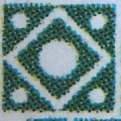
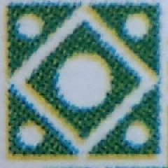
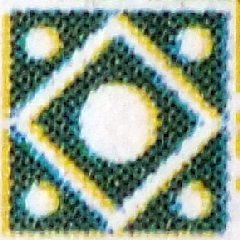
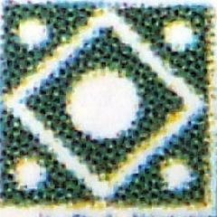
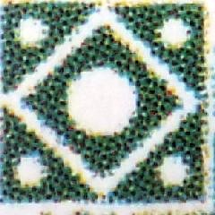
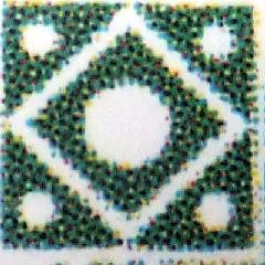
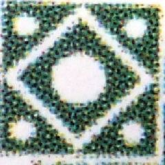
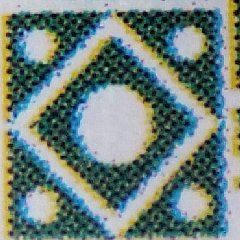
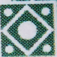
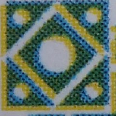
It may be that the original printing for the stamps may be the ones with the best colour registration - Using four stamps known to be from the original print runs, this can be shown by high resolution images of the top left corner cartouche. Two, one from the pre-production minisheet and one from a Bath perforated stamp are spot on. The other two, another Bath perforated stamp and the unperforated sheet, show a diagonal colour separation of the blue and yellow.
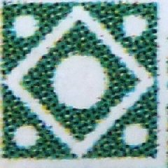 
Bath perfed mini-sheet
Bath perfed unperforated
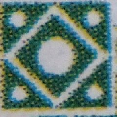
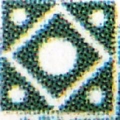
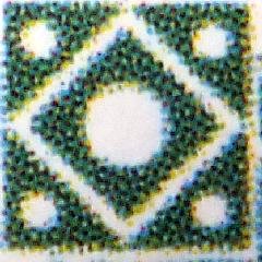
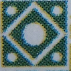
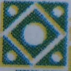
A look at an example from what is most likely from the second print run shows a similar pattern to the third and fourth stamps above. This suggests that a change to the printing process was made part-way through the original print run - quite early on in fact if Bath perforating was still being used - and the same print and setting continued into the second print run (when the sheet margins had text and logos added).
second run
Turning to the stamps from the third print run, these are those sheets printed with two extra sports printed at 90 degrees to the main sheet. We know that there were only 111 sheets printed and only 222 sports went into LBEs, but they were phased in. Below are the close up views from the sports from this run, in the correct rotation to compare with the close ups above.
Firstly, one can see that both Falling Man sports show the same slight colour registration misalignment, while the Bigger Splash and Weathervane sports make up another pair this time with virtually no misalignment. Of the two Open Door sports one compares with the Falling Mans and the other Open Door with the other two released sport. It seems quite likely then that these last sheets were printed in two batches.
Falling Man 1 Falling Man 2 Bigger Splash
Weathervane Open Door 1 Open Door 2
Using this information I can, with some degree of confidence assign two original sports in my collection to particular print runs. They are clearly from different runs because the shades of green are so clearly different. The Splash sport has text selvedge identifying it from the second or third print run. The close up most matches the Weathervane close up, thus from a late batch from the third print run. The Falling man sport has a pattern that matches both a later batch from the first print run, or from the second print run.
Falling Man Splash
These three images below come from common stamps which cannot be positively assigned to any of the three print runs. They are different from the third print run examples, and though having the same pattern as two from the first run, the degree of colour displacement is different.
The first of these three images is from a stamp with the noticeably different gum and that confirms that the slighter registration problem is a reflection of a different print batch using a different paper source, whilst the other two could possibly be from the same batch with the differences being merely an artifact of obtaining such an enlarged image. In view of my estimate that around 50% of all the stamps are from the second print run, and it would have been during this period that most changes to the printing and settings (to improve speed and quality), it is quite possible that these are all from different batches of the second print run.
I had also hoped that close and detailed examination of clouds and sky behind the tower may also elicit some distinguishing characteristics of the different print runs, but the different registration patterns and degrees of the same created artifacts that served to hide the underlying print details.
For those who feel that the examples shown above are reflection on lack of quality assurance during stamp production just bear in mind that Ankh-Morporks printing technology was in its infancy. What would you expect? The differences do not show up macroscopically, except in some different shades, and all in all, it makes collecting even more fun/
|