|
As shown in other articles on this site, a high resolution image of part of the stamps can reveal the existence of different print runs and help explain some apparent shade variations. The first Merchants Guild stamps are no exception.
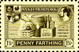
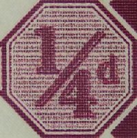
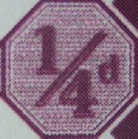
The Penny Farthing
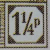 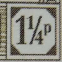 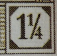
The first two lower right value cartouches show a similar and consistent pattern to the application of the inks, This contrasts with that of the third, a sport. The patterning is the same but is rotated 90 degrees (the commons showing a NE to SW pattern and the sport a NE to SE pattern), suggesting this sport came from a different printing from the commons. This is supported by the improved horizontal bands on the middle left of the sport, compared to the other two. Despite this these three stamps appear essentially identical in colour and intensity in daylight and under a magnifier. Only the horizontal bands distinguish the printing and then only with a magnifier. This improvement on the horizontal lines is just as dramatic in the background shading to the central image.
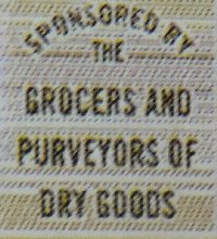 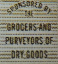
The Three Pence
Three patterns are revealed on the Three Pence stamps. Again there is a NW to SE pattern on the middle example. The other two have a similar ink dot pattern, but one has the horizontal bands on the left clearly defined, comparable to the sport example of the Penny Farthing stamp above. Again there is a big difference in the background shading
  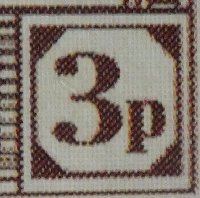
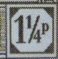
The more diffuse background shading in the left hand example may be viewed as an improvement in the overall appearance of the stamps, at the expense of clarity in the horizontal bands to the left of the value tablet. Working on the assumption that reprints incorporated improvements to the printing process it would seem the left hand examples were later from print runs. Of course, it may be purely coincidental to printing the sheets portrait or landscape.
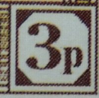
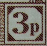
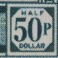
The Fifty Pence
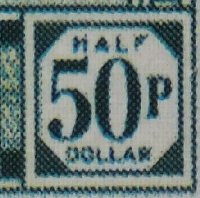 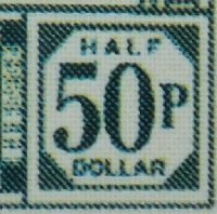 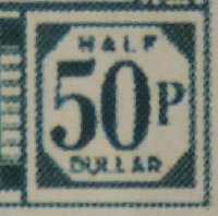
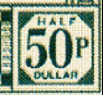
Three different patterns are revealed on the fifty pence stamps, with only the middle example having somewhat of a counterpart in the other two values above. The left image shows a very scrambled appearance to the banding to the middle left. The right hand image is from a sport with a noticeable yellower shade (both of the green and overall background wash). Could this be from the Sports Only sheet? That would have been from a definitely different print run. Note that the U in DULLAR extends below the other letters suggesting this sport was created by replacement of a single letter, rather than changing the entire word. A close look at another sport shows the U to be normal sized. Was this sport detail for the Sports Only sheet redrawn perhaps?
The common stamp above and the sport
illustrating the differences
The Farthing
All my examples show the same pattern under hi-mag, but from the discrete banding behind the value they would seem to all be from my supposed first or early print runs.
From the Proof Sheet
The issued proof sheets use the same versions of the stamps as those issued, and these will be subject to the same influences as the stamps. These images are taken from the Merchants Guilds proof sheet.
Conclusions
The original printings of these stamps resulted in horizontal line clarity of the printing. The Sports Only sheet had similar treatment, but being printed at a later date the inks or settings were different resulting in identifiable shade differences. Later print runs used a different printer and the print orientation changes from landscape to portrait, or vice-versa, and resulted in a more diffuse background to the central image - which can be seen as an improvement in terms of overall finished appearance of the stamps. Whether this was only due to direction of printing or whether tweaking of the software which controlled the printing in order to achieve better resolution is unknown. I think any redrawing of the artwork can be ruled out.
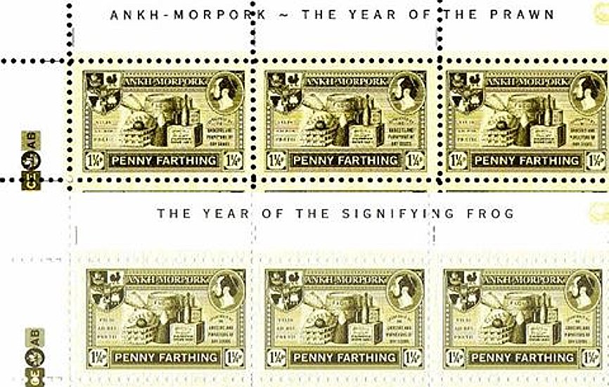
This may all be explained by a discovery in 2017 of sheets inscribed YEAR OF THE SIGNIFYING FROG, as opposed to the expected YEAR OF THE PRAWN. This confirms that there was a reprinting of at least the 1¼p and 50p sheets, and most likely the 3p sheets as well. The differences in colour can clearly be seen in this comparison
|