|
Not too much to talk about these apart from .......
...... perforations. There does seem to be an increased number of perforation errors during this year. Here are two from the 10 pence definitive. One has a badly misplaced top horizontal perforation line and the other is totally missing the right marginal perforations.
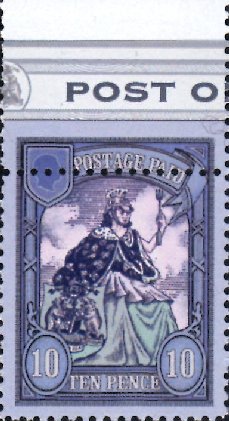 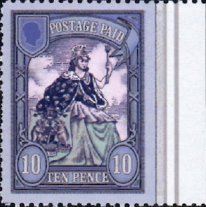
I now always check my stamps for these errors, both on delivery, and before submitting GCTS returns. It is best to look at the reverse of the stamps, as these errors stand out much more obviously.
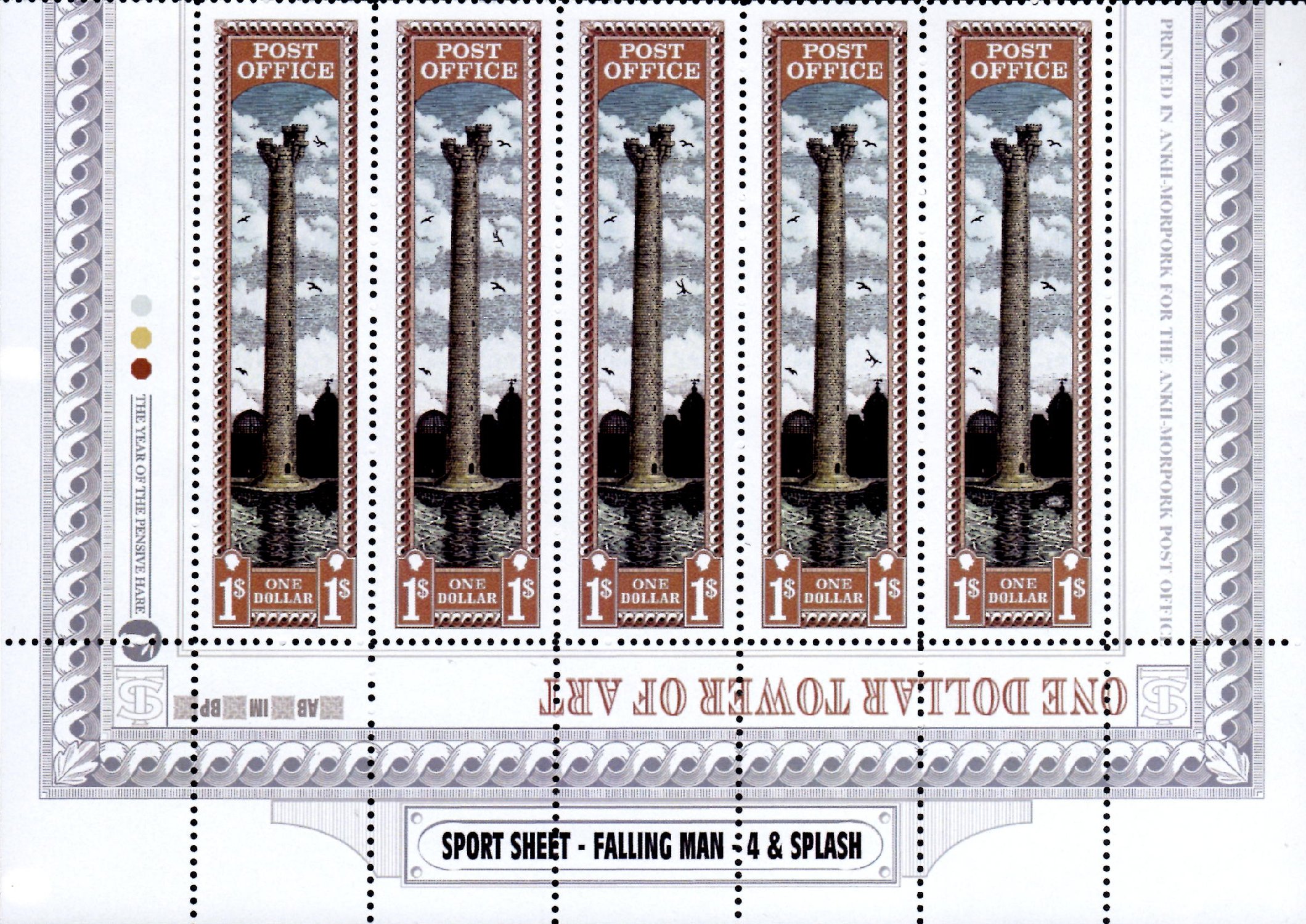
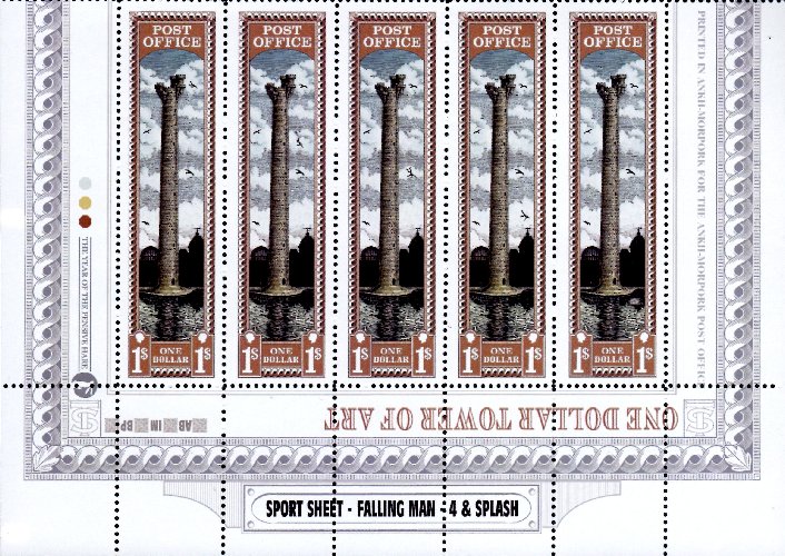
......... and TOA sports. This year there were five sports. There were 4 progressive Falling Man sports, which either replace or appear between the right hand birds, and the inevitable Splash. The unaffected birds do not move or transform. The sports formed the bottom half of a sheet of ten stamps, with five commons on the top row.
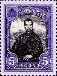
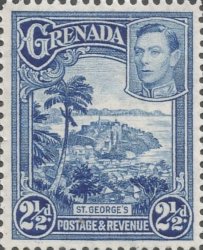
............ and RW counterparts. The design of the Five and Ten Pence stamps have affinities with a number of British colonial issues, but a reasonable match can be made with the Grenada George V 2½d of 1934 rehashed as the George VI 2½d of 1938. The appearance of the stamps are quite different, but the same elements are present. The 5p and 10p DW definitives also have a feature that makes a reappearance in another fantasy stamp series. Do you recognise it?
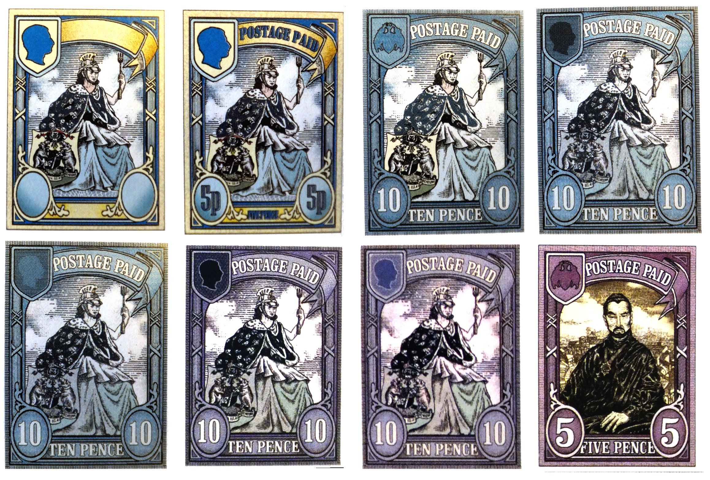
...... and there are a number of prints housed as part of the Discworld Stamps archive in the British Library which show how the 10p Morporkia developed. This composite picture below shows the evolution of the design, as far as I can ascertain, with each image mostly taken from a single large size design printed on an A4 sheet.
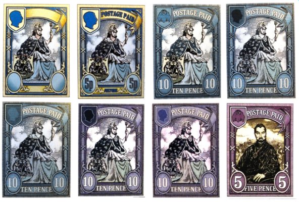
One can see that the image in the left hand top shield was experimented with quite a bit, with the arms of AM and the Vetinari head being tested within the design. Morporkia herself is much as per Alan Batleys original, except that she is now facing forward and her coal-scuttle helmet has grown a crest. The overall colour of the frame, whilst varying from a blueish to a purplish shade, is essentially the same colour - one can adjust the hue and move through these shades.
|
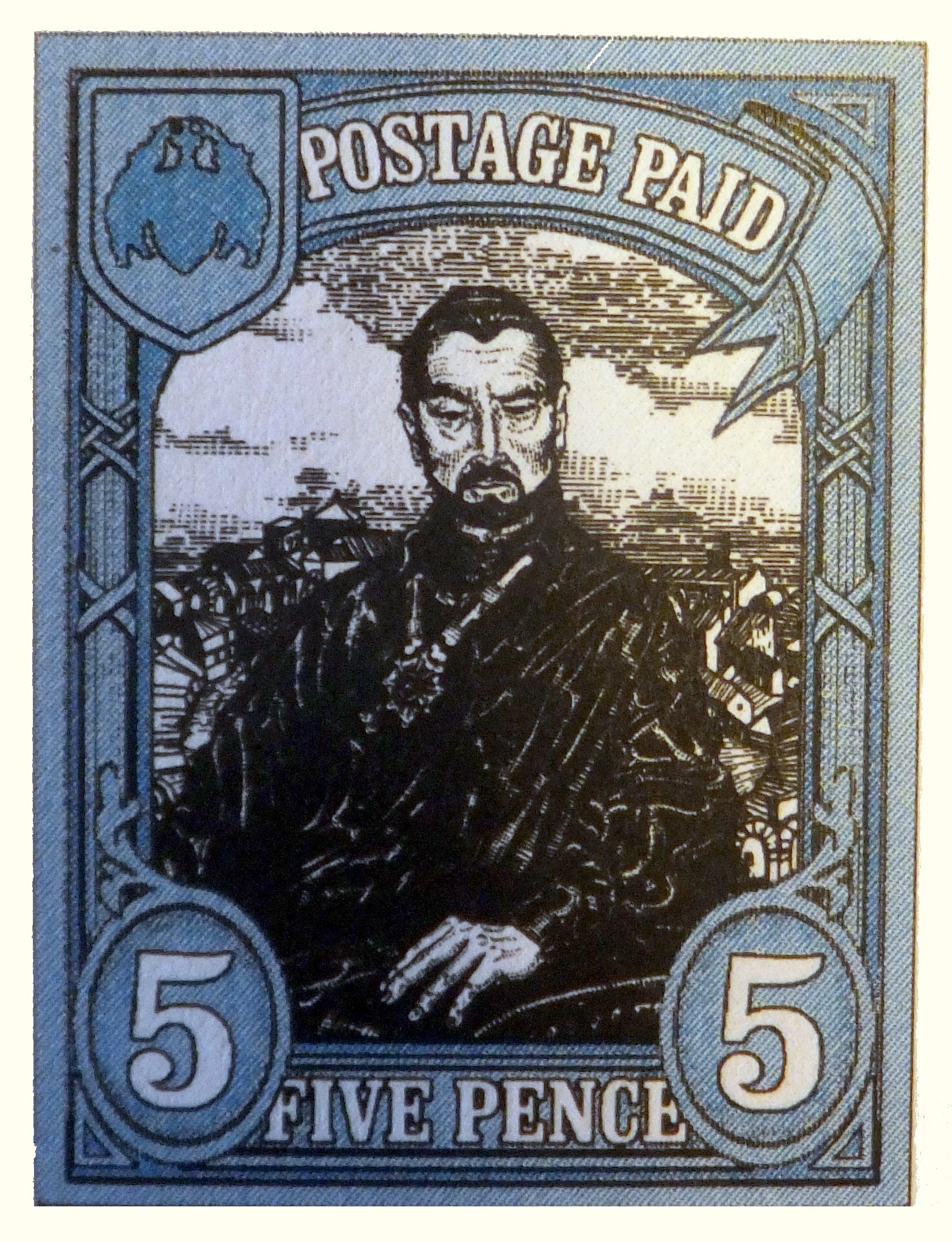
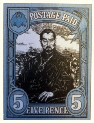
One early test print shows the 5p stamp in a bluer shade than issued, but the 5p Vetinari shown above shows that stamp at its development at the same time as the last Morporkia, bin printed on the same test sheet. This Vetinari image is a previously unused piece of Alan Batly artwork, placed in front of a rather indistinct Ankh-Morpork background. Why the crossed ribbons on the frame side should be virtually unshaded in the 5p, yet shaded in the 10p is unknown. Side by side they look a bit incongruous. These ribbons do give a huge hint to who was behind the designs, as the same motif can be found on many stamps in Hilary Daniels range of Pharos stamps.
|
|
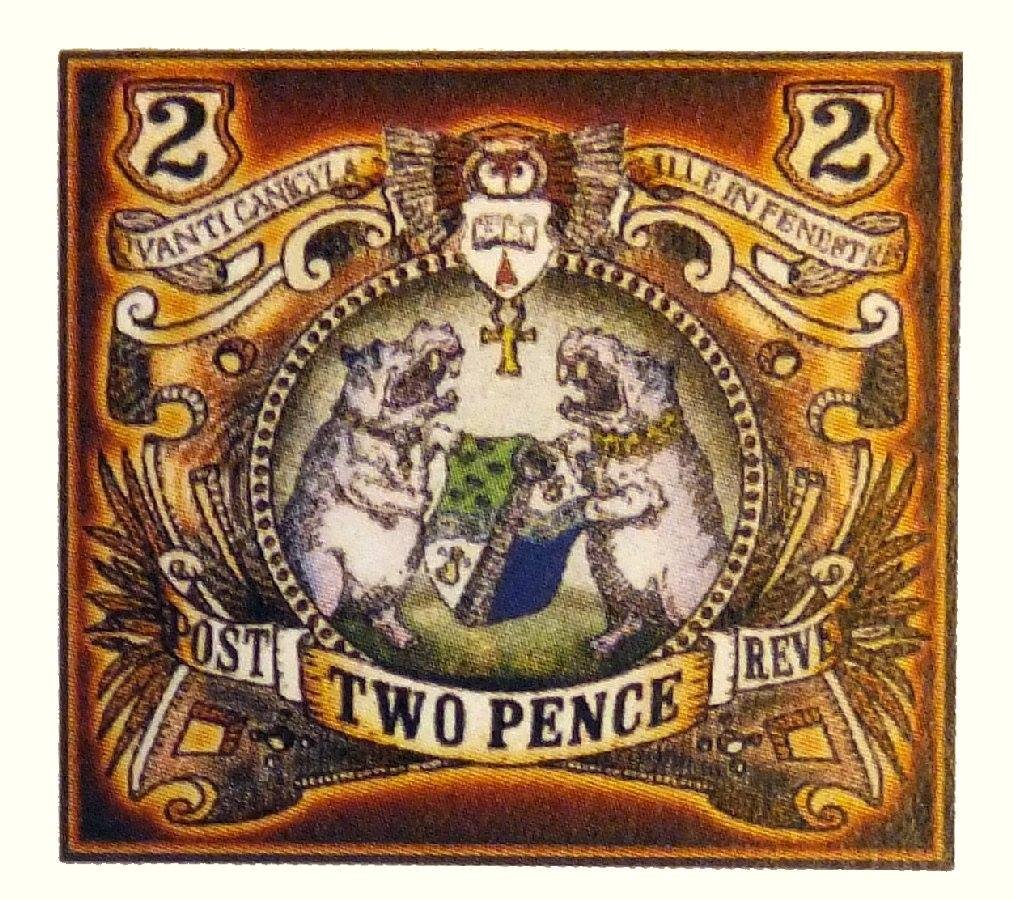
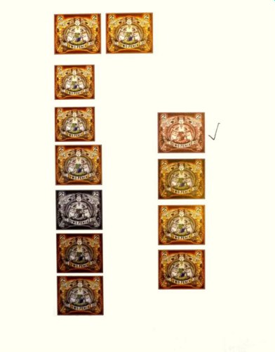
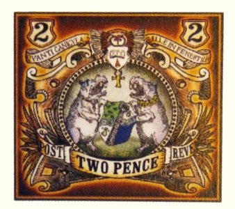
........ and there was the Two Pence Ankh, which went through a slightly design process as this printout from the British Library shows. This multicoloured approach is unusual, but artist Stephen Player shows an image of the Arms using the same colours on his web page. The tick is against a single coloured option but not the final colour, which was a rather lurid clarety colour.
|