|
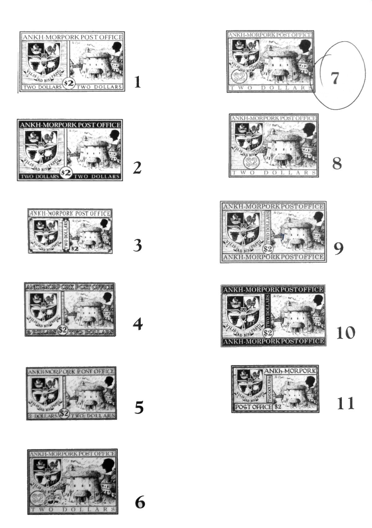
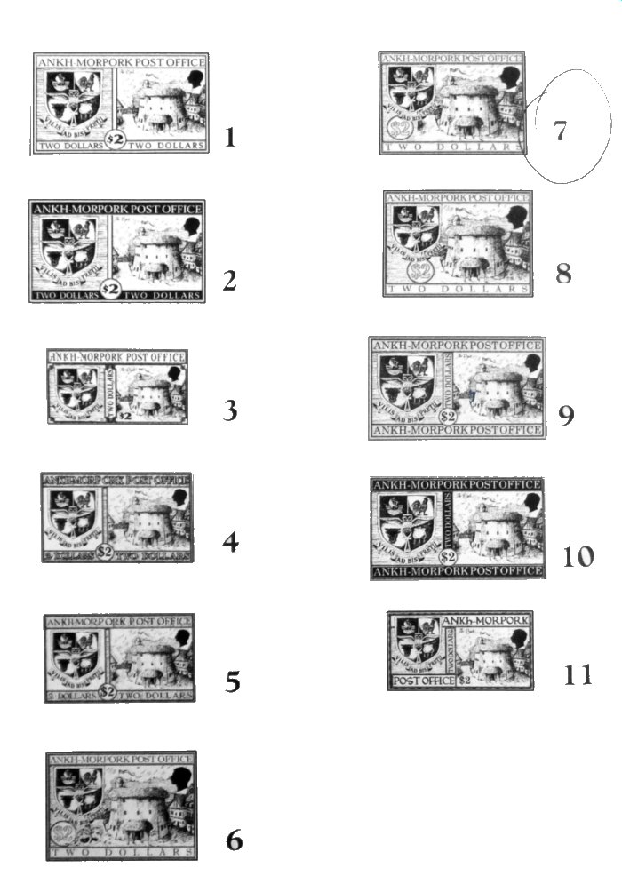
The artwork for the Places of Interest stamps, drawn by Karen Dupe, was put into a number of frames during the design stage. Eleven variations of trials for the $2 Dysk stamp can be found on an A4 sheet held by the British Library in their Discworld Stamp archive. You can see that they are all variations on a theme, with the (somewhat redrawn) Merchants Guild coat of arms also a prominent feature. There are experiments on the text, with different typefaces, and using white text on a dark background.
Design 7 seems to be indicated as the favoured one, but still has notable differences to the issued stamp. The value tablet went from round to rectangular and, most notably, the height and width proportion was changed to a taller stamp. The TWO DOLLAR text at the bottom clearly does not fill the panel without an extreme lengthwise stretch and looks bad against the bunched up ANKH-MORPORK POST OFFICE at the top; it looks better repeated twice on the issued stamp, though still a bit odd. A very pale cream background for the stamps toned down the harshness on the eye of the black and white.
There would almost certainly be a parallel trial sheet for the $1 Watchhouse stamp. Whether the designs were the same with just the building illustration change, is unknown.
|