|


 |
|||
|
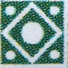
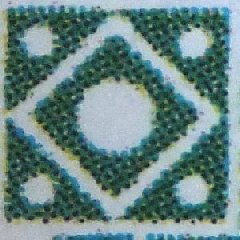
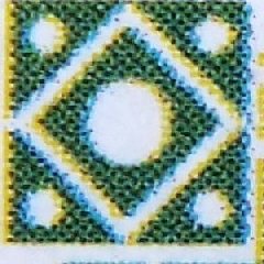
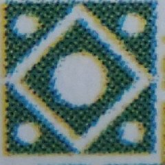
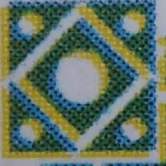
Looking at extreme close-up images may help to identify stamps from different print runs, or batches within print run. Looking at the colour registration - the stamps being printed by overlying yellow, blue and possibly black inks (no magenta has been detected) as successive layers, with intensity dictated by the dot sizes - different patterns of colour displacement are revealed. The differences will be a combination of factors such as print direction, and type and model of printer. A particular pattern may be found from one particular printing machine with misaligned colour printing which is adjusted later. I had hoped that colour registration may have provided an explanation for the differences in colour hues seen, as opposed to intensity, at a macroscopic level. However, while there was some correlation, with the more yellowish green stamps showing greater colour separation, the lack of any separation did not necessarily mean a greener stamp. Thus the actual inks used or the black screening also play a role in the shade differences. It may be that the original printing for the stamps may be the ones with the best colour registration - Using four stamps known to be from the original print runs, this can be shown by high resolution images of the top left corner cartouche. Two, one from the pre-production minisheet and one from a Bath perforated stamp are spot on. The other two, another Bath perforated stamp and the unperforated sheet, show a diagonal colour separation of the blue and yellow
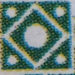
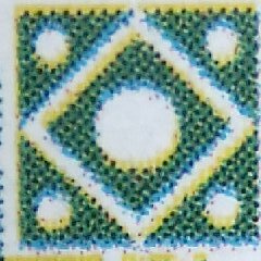
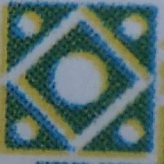
Looking at stamps that can only have come from the final print run, the later new sports, we see different patterns. The first of those below is a conventional sport and this displays a left-right, rather than the diagonal screening shift of those two above. The same is found from a common stamp that came from the third run. The third and fourth images, from the new sports, show a diagonal shift. However this is different to the examples above. The new sports are rotated 90 degrees to the main stamp section. Do that to these and the blue-yellow shift is opposite. However these images show the screening patterns that are found on the main sheet stamps and the new sports from the third print run sheets.
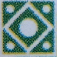
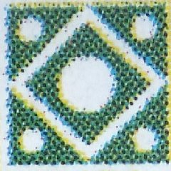
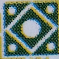
These three images below come from common stamps which cannot be positively assigned to any of the three print runs. They are different from the third print run examples, and though having the same pattern as two from the first run, the degree of colour displacement is different. It would require many more examples to suggest that they are from the second print run.
I had also hoped that close and detailed examination of clouds and sky behind the tower may also elicit some distinguishing characteristics of the different print runs, but the different registration patterns and degrees of the same created artifacts that served to hide the underlying print details. For those who feel that the examples shown above are reflection on lack of quality assurance during stamp production just bear in mind that Ankh-Morporks printing technology was in its infancy. What would you expect? |
|||