|
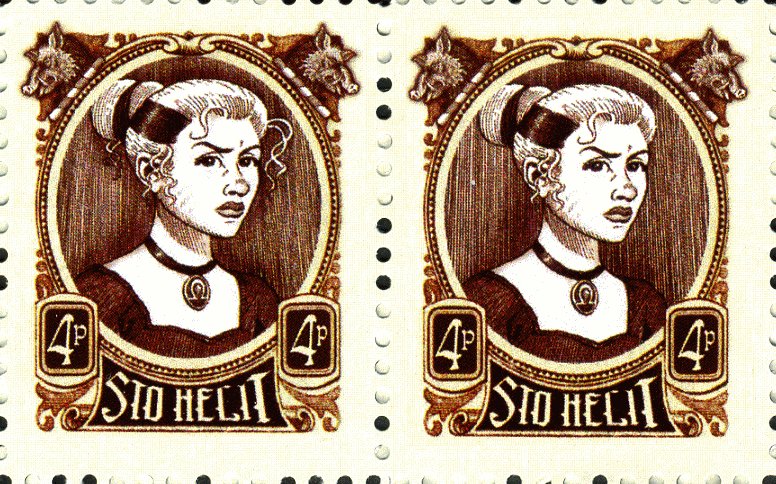
To accompany the One Pence stamp was a Four Pence stamp based on the previous Susans. The release blurb stated that the withdrawal of the old 5p stamp was balanced by the release of 1p and 4p stamps. Superficially it looks like a revamp of the old 5p, but in fact is quite reworked by Colin Edwards. It is the same height of the 5p, but is 2mm narrower. The same David Wyatt image of Susan Sto Helit is reused (well, once you have paid for an artist you would want to make the most of it), but not only do we see more of her below the chin, but the proportions have changed giving her a more rounded face. Her frame is a slightly more elongated ellipse and the boar`s heads are a slightly larger feature on this stamp.
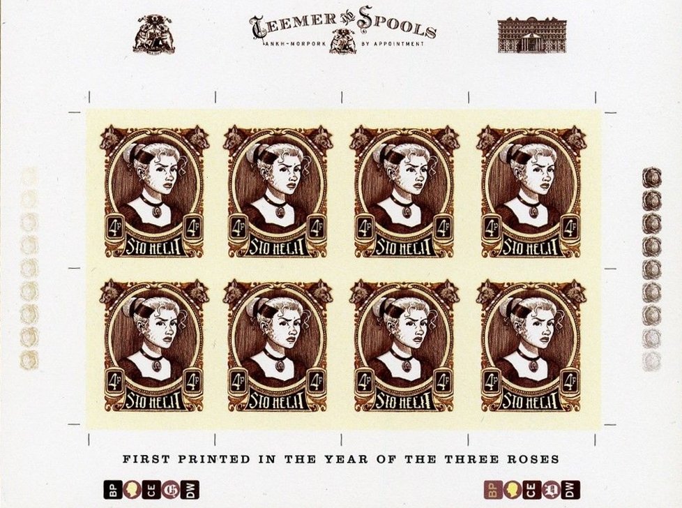
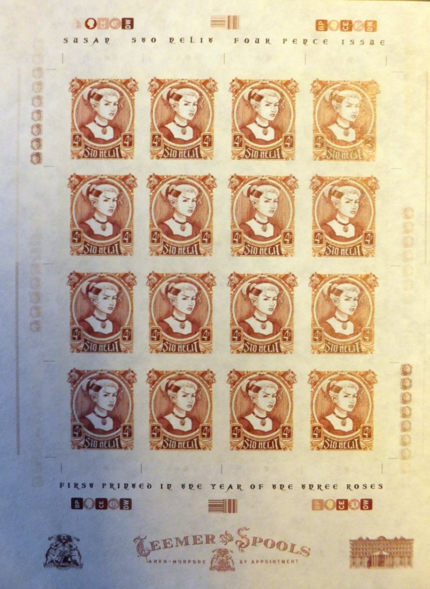
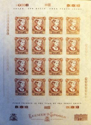
The stamps were printed in sheets of just 16 stamps, though with the final sheet size there would have been room for another row of four stamps. There is a single good hair day sport. To date no varieties have been noted or reported.
The Common and the Sport.
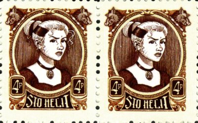
A few pre-production items have surfaced and reside in collections. And they provide an insight into the evolution of the stamp. A sports trial sheet shows the issued sport (top row position four) and to left of that is the eyes right unreleased sport. There may be further ideas on this but I lack an image with sufficient resolution. However I suspect there is a repeat of the missing triangle of the Green Susan. Click on the sheet for a best possible image.
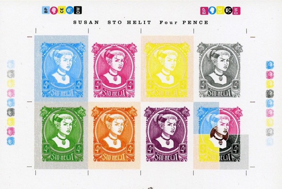
Below is a progressive proof sheet. Colour printing is achieved by mixing cyan, yellow, magenta and black inks. The top row shows the stamp printed with the contribution of each colour to the finished article The lower row shows these in combination.

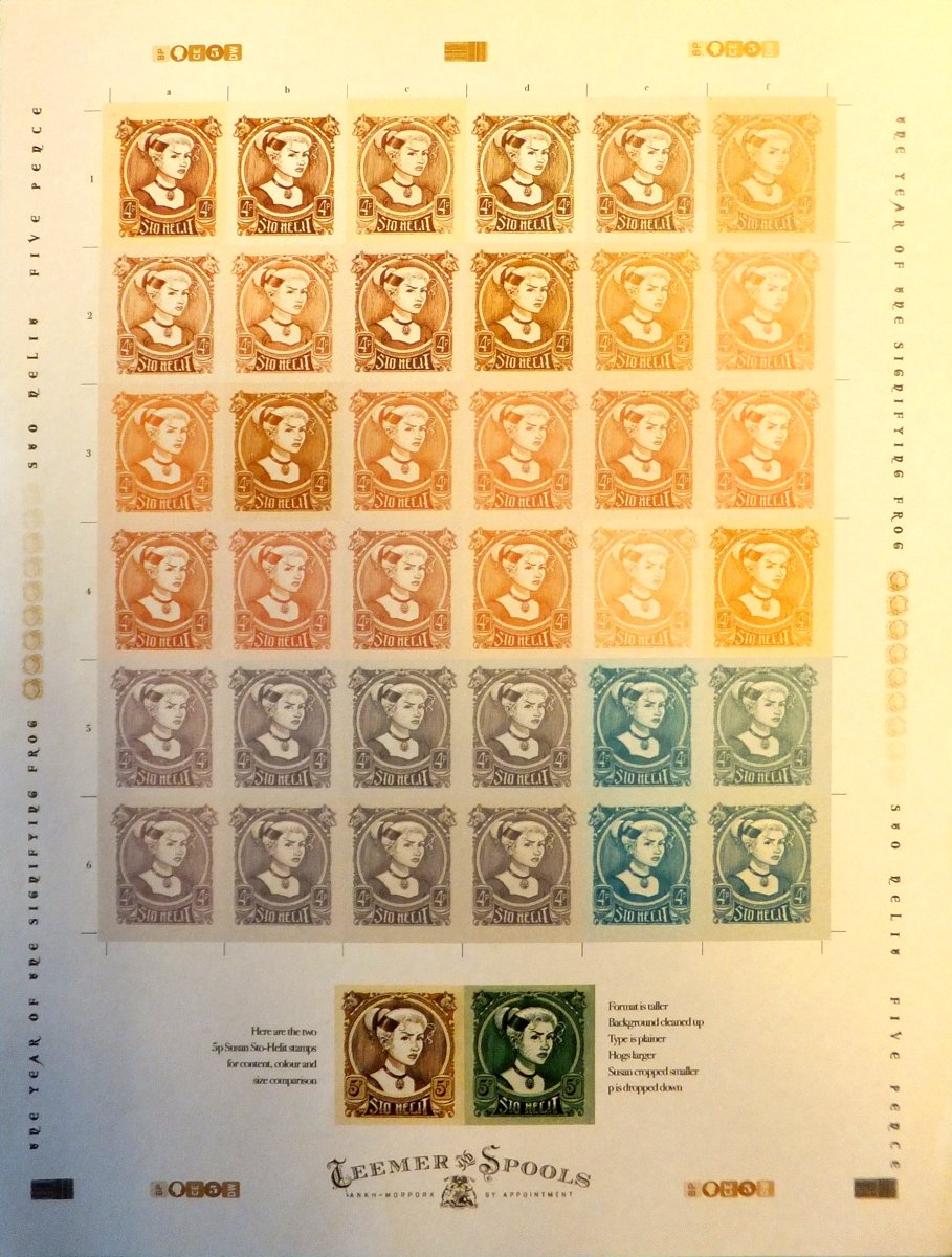
A colour trials sheet shows both the range of options considered during the design stage demonstrating what will and will not work with the artwork. Note that a variety of background colours were used to complement the test colours. Interesting to see a hark back to the 5p stamps from two years previous.
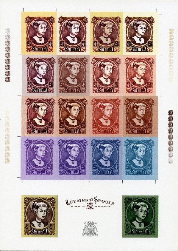
A second sheet, possibly a combined artwork and colour trial, tells more of the story. The text towards the bottom, by the 5p comparison images, confirms what was said above and adds more. It states that the portrait format is taller, the background has been cleaned up, the type is plainer, the hogs (not boars!) are larger, Susan has been cropped, and the p moved down. So, quite a bit of work went on in order to transform the 5p into the 4p stamp. The images below, reproduced by permission on the British Library, suffers from being taken under indoor lighting. However, it is possible to see the range of colours, and depths of colours investigated for the stamp.
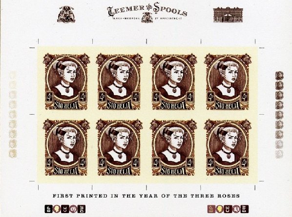
Another sheet reveals that the issued colours were likely to have been a late decision. An A4 sheet with two imperforate A5 sheets of the 4p stamps (complete with final marginal decorations) shows them in one of the more orangy-tan shades from the top of the trials sheet. In fact the issued colours of deepish-brown and cream does not figure on the trials sheet.
|