|
I have noticed that these stamps must have been subject to different print runs, with both colour and paper variation. The Five pence value shows the colour variations best. Unfortunately I neglected to note which shade was the original issue and which were from later printings. And actually trying to give a name to the shades is purely subjective, but I have referred to them as chocolate, yellowish-brown, and intermediate. These three images were obtained from three stamps on the same scanning pass, and so accurately do represent the differences.
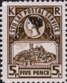 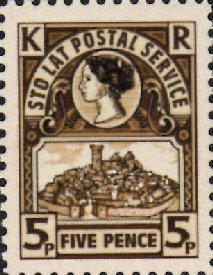 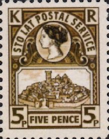
Chocolate Intermediate Yellowish
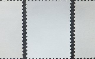
This is where it starts to get complicated! The stamps seem to be on two different papers, identified by the colour of the gum - either white (transparent) or slightly creamy. Both the Chocolate shade and the Yellowish shade have been found on paper with both gums, while I only have the intermediate colour shade with white gummed paper; though this does not eliminate the possibility that this too has been printed on cream gum paper. This eliminates the paper as being the source of the colour variations. Both gums are very glossy with a similar appearance though with the white less glossy, raising the possibility that the prints are on the same paper, but with some being older stock and slightly discoloured. This photo shows a white gum stamp between two cream gums, but does not really do justice to the differences.
What does a close-up look reveal? All three are remarkably similar and so likely to have been printed by the same process, and same printer. This leaves the difference in shades being a result of the inks used and the intensity of ink applied to the paper.
With both stamps being printed on one sheet its logical that the variations above are reflected in the Two Pence stamp; and indeed they are, though the colour variance is not quite as pronounced. These stamps seem to have very slight pinkish hue in the background, but this does not seem to vary across the shade variations. Instead it would appear to be the intensity of the black ink that is a major determining factor, and this would also explain the variations on the five Pence stamps too.
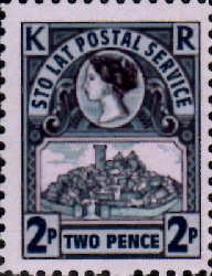 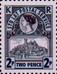 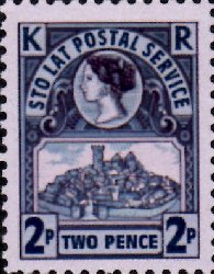
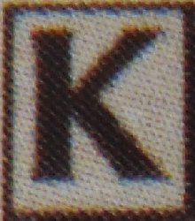
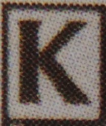
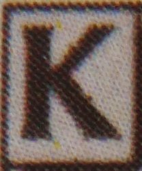
Slate blue Intermediate More blue
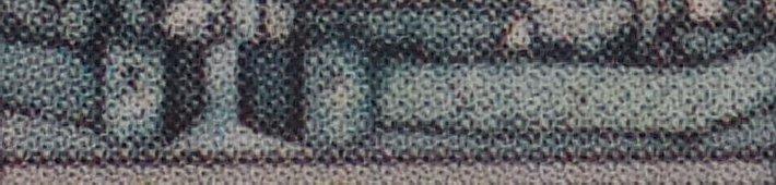
However, the colour variance also seems to be also associated with the green and blue inks. More green and less blue results in the slate coloured stamp, while the reverse is true for the blueish stamp, as close up of the town walls reveals.
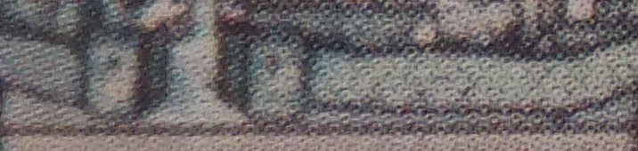 Slate Slate
 Inter Inter
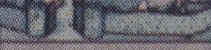 Bluey Bluey
You may have noticed how the high detail images show a different microscopic pattern of litho printing. The result is that solid colours appear more so on the finished stamp, and these print settings were widely used during this year. However, and this is a personal opinion, I think that this is achieved at the expense of a lack of detail. Look back at the artwork for the town and you will see that the final stamps really do not do justice to drawing. The solid colours are too solid and there is a lack of subtlety on such prints.
Thus there were perhaps four prints of these stamps, two on each different gummed paper.
|