|
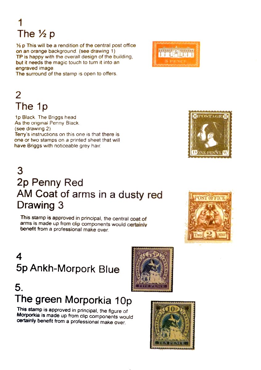
Amongst the wealth of material I saw in the Discworld Stamps archive held by the British Library were two printed sheets showing the early designs for the AMPO definitives with briefing notes for Coliin and Alan from Bernard (and perhaps Terry himself). They probably date from late 2003. Here they are by permission of the British Library. Click for a larger image
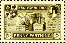
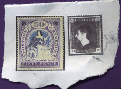
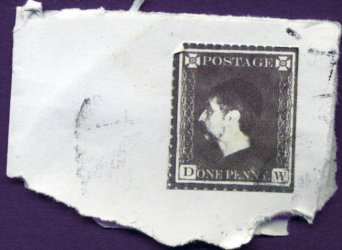
I will expand on these in the individual stamp sections. Some of these were actually printed as stamps and used on post sent from Wincanton - see picture below. It reveals that the idea of winding up Stephen Briggs by having the Eminence Gris with greying hair was there from the very beginning. While the overall ideas were there, they really needed that professional finish provided by Alan and Colin.
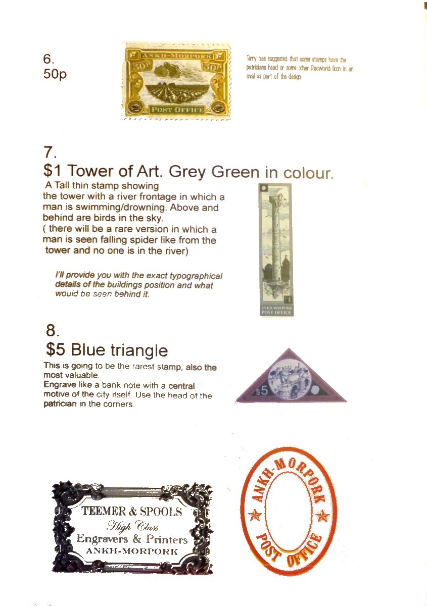
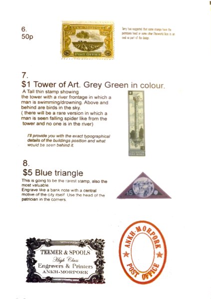
There does seem to be something odd about these briefings however! Look at the $5 triangle. How can that central image of the bridge be there before it was drawn? Remember that this the brief for the design team. It actually says a central motive (motif?) of the city itself - pretty vague. At this point showing one of the bridges of the city was not on the cards, but after a suggestion by Terry for a bridge it was the Bishop Bridge in Norwich, local to Alan Batley, that became the model for the final illustration. The rest of that design is probably from the time, but the bridge is shown in an interim state, with the assassin and small boy on the bridge, but no watchman or wizard.
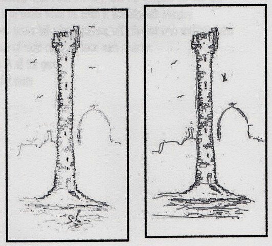
The $1 Tower of Art image omits the swimming man mentioned in the text. It looks like a much improved version of these drawings, one of which appeared on the History of Discworld Stamps poster, that do show a swimming and a falling man. The Tower turrets match these sketches and differ from the final product drawn by Alan Batley. I thought I was told that Terry himself sketched these, but may be mistaken.
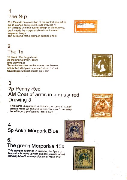
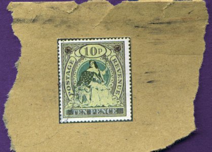
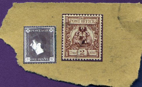
These show some of the lower values, as shown on the briefing sheet or contemporary ideas, printed as stamps and torn from envelopes sent through the post around January 2004
There is one other thing that strikes me as odd on the print. I certainly remember being told that Terry had originally wanted Cripslocks to be the fictional printers of the stamps. There was a late change to Teemer & Spools because Criplocks were engravers, rather than printers, and the stamps were taking on a printed look. Terry wanted everything to hold up to scrutiny for continuity. The T&S stamp seems wrong to me.
|