|
(Stanley) put a sheet of slightly damp greeny-grey stamps on the desk. The first dollar stamps, sir! he announced.
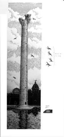
My word, Mr. Spools has done a good job here said Moist, staring at the hundreds of little green pictures of the universitys Tower of Art. It even looks worth a dollar!
Yes, sir. You hardly notice the little man jumping from the top. said Stanley.
Moist snatched the sheet from the boys hand. What, where?
You need a magnifying glass, sir. And its only on a few of them. In some hes in the water. Mr. Spools is very sorry, sir. He says it may be some kind of induced magic. You know, sir? Like even a picture of a wizards tower might be a bit magical itself.? Theres a few faults on some of the others, too. So the Discworld stamp sports were born.
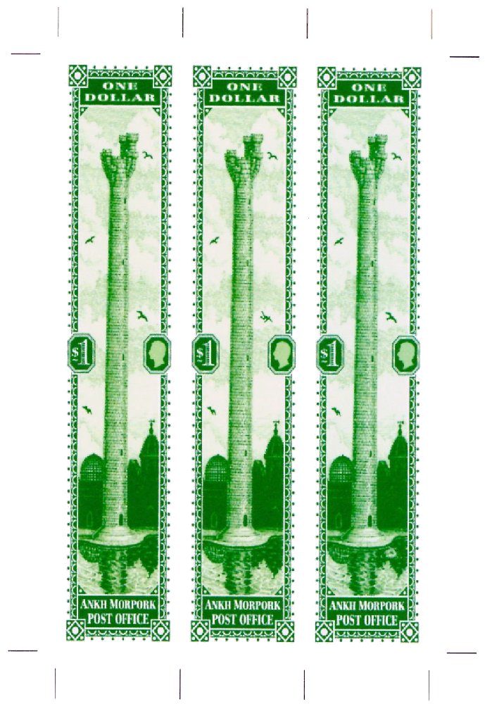
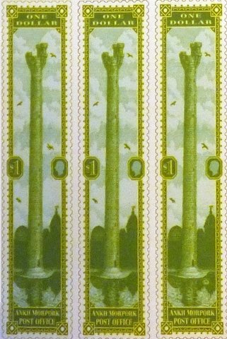
The Tower of Art $1 green, issued in what would later be known as The Year of the Prawn, is one of the most iconic of the Discworld stamps. Here I hope to provide some background to the stamps, and to mention all the collectables deriving from this one issue. It is not an easy task to be definitive (pune intended) on some points because in those early days of 2003-4 the stamps were not expected to be as popular as they soon became; it may well have all stopped after the original seven stamp issue. Few records were kept, and much information comes from memory - notoriously labile or unreliable. However the stamps did continue, and more and more stamps were required. It is generally said that there were three print runs of this particular stamp. The term print run here refers to stamp sheet layout and design, than to actual batches of stamp sheets delivered to the Discworld Emporium within each print run; of these there were many, and thus the small variations between the batches provides a dedicated collector with ample opportunities to waste brain cells squinting at their collection.
If there is one stamp that sums up just what Discworld Stamps are all about it is the $1 Tower of Art. It is probably the most unusual stamp that has been produced to date; Terry Pratchett himself sketched its design out when the idea of Discworld Postage Stamps was first being discussed. The concept was worked up by Bernard Pearson before being given to Alan Batley; the artist engraver, who gave the design the superb look you see now. If you have good eyesight you can see the falling man and the splash as he hits the river Ankh. The view of the Unseen University in the background is as accurate a depiction you can get, without being there, and of course from the sketch on the back of an envelope came the words in the book, and thus a small piece of gummed paper that is the essence of Discworld. So said Bernard Pearson a few years ago.
A series of images can show the evolution of Tower illustration and the stamp design.
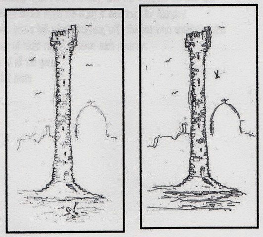 The briefing notes from late 2003 stated A Tall thin stamp showing the tower with a river frontage in which a man is swimming/drowing. above and behind are birds in the sky. (there will be a rare variation which a man is falling spider like from the tower and no-one is in the river). I will provide you with the exact typo-graphical details of the buildings position and what is behind it. Thus the variant or sport is an early concept, but for some reason the swimming or drowning man idea was dropped. I have heard that Terry would have had a model of University in his lounge and would indeed be exact regarding the background buildings. He is also said to have commented that anyone climbing the tower would have had to have a breather before jumping and this be sure he really wanted too. The briefing notes from late 2003 stated A Tall thin stamp showing the tower with a river frontage in which a man is swimming/drowing. above and behind are birds in the sky. (there will be a rare variation which a man is falling spider like from the tower and no-one is in the river). I will provide you with the exact typo-graphical details of the buildings position and what is behind it. Thus the variant or sport is an early concept, but for some reason the swimming or drowning man idea was dropped. I have heard that Terry would have had a model of University in his lounge and would indeed be exact regarding the background buildings. He is also said to have commented that anyone climbing the tower would have had to have a breather before jumping and this be sure he really wanted too.
I was told these sketches were done by Terry himself, but the falling man one is reproduced on the History of Discworld Stamps poster and credited to Bernard Pearson.
|
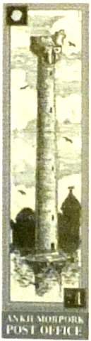
This is the impression of the $1 stamp from the briefing sheet supplied to Alan and Colin. This is clearly based on the above sketches as evidenced by the similarity of the turrets at the top. This is almost certainly the work of Bernard, but features neither swimming or falling men are evident. Surprisingly the birds are roughly in their final positions.
There is a rudimentary Patrician head and $1 value tablet, but these are there probably only as a guide as to what should be included. The colour is described as grey-green - exactly as stated in Going Postal. Despite that the colour greened up quite a lot as the design developed.
|
|
This is the artwork from Alan Batley for the illustration in what looks to be a completed form. Included are overlays for the two original sports, with four option for the falling man. These have been drawn over-scale compared to the tower for clarity.
The sharp-eyed amongst you will have noticed that not only was 15% cut from either side for the stamp, but also that the reminder was squeezed widthways to create a taller narrower illustration.
While Alan was doing this Colin was working on the framework and the overall design.
|
|
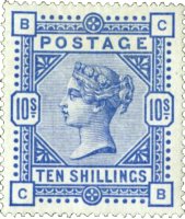  The frames inspiration had to come from somewhere and the best place to look is a classic stamp, possibly the GB 1884 Ten Shilling cobalt blue with its bold design to give character to a high value stamp. Somewhere along the line it was decided that the dimensions of the stamp should emphasize the height of the Tower and a size of 100 mm tall and 20 mm wide was decided upon, leading to quite a degree of stretching of the QV design The frames inspiration had to come from somewhere and the best place to look is a classic stamp, possibly the GB 1884 Ten Shilling cobalt blue with its bold design to give character to a high value stamp. Somewhere along the line it was decided that the dimensions of the stamp should emphasize the height of the Tower and a size of 100 mm tall and 20 mm wide was decided upon, leading to quite a degree of stretching of the QV design
From what seems to be Colin`s final design submission document he says I am worried about the size of the $1, when seen in scale it seems huge. The British Library version of this page has the stamps (common and both sports) in what is effectively two shades of green, but another copy of this has them in the final released emerald shade. Despite the mock-up fake perforations these are now reproduced with the final proportions of the issued stamps.
These sports were present on the final preproduction print runs. Prior to the press day at the Bath Postal Museum a print run for final approval was produced for all the original stamps, as miniature sheets, using the same paper and printing process that would be used for the full sheets that would be perforated at the museum. These and the subsequent batch of sheets were all printed by a company based somewhere in East Anglia. The $1 miniature sheet had three stamps; one regular stamp and one each of the two initial sports; the Falling Man and the Splash.
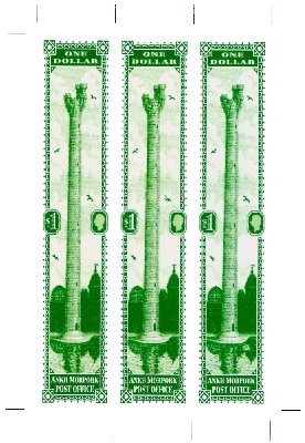
For the record, this stamp was released on the 9th of July 2004, and withdrawn from sale in February 2006, when the Year of the Signifying Frog definitives went on sale.
|