|
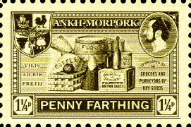
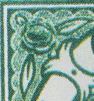
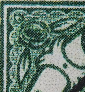
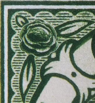
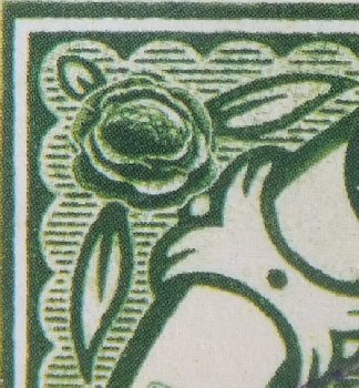
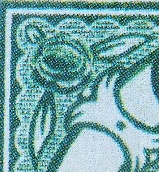
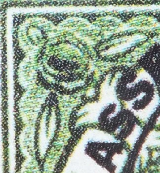
Here are a collection of close-up images of the top left corner of the stamps from varied sources. They were taken at the same time, same position, same lighting and same camera settings. Apart from resizing for comparability there has been no manipulation of the images. It seems that the use of the camera accentuates the colour differences between the stamps, but these images can be used to compare the resolution and high detail print patterns of the different stamps. Click on any image for a larger version.
Pre-Bath test print from a Wincanton perf from an Enschede sheet
First Pseudopolis cover Second Pseudopolis cover Third Pseudopolis cover
Some observations are immediately apparent.
The Pre-Bath print is a lower resolution than the Wincanton perfed stamp. It is known that during their lifetime attempts were made to improve quality, so the Wincanton stamp may be from a later batch. I need a Bath perforated stamp in order to draw further conclusions regarding the earlier prints.
The Enschede stamp and that from one first Pseudopolis cover are clearly the same print. The slight colour difference will be due to the white envelope as a background. These are so crisp you can see the detail of the cabbage hearts (just).
The stamp from the second Pseudopolis cover bears a great similarity to the Wincanton, but it is not quite as good a print, and is definitely a paler print. Again the background (a brown envelope) may have affected the colour the Pseudopolis cover stamp, but by eye there is a slight difference in hue between the two stamps.
The stamp from the third Pseudopolis cover has the lowest resolution of all, and is clearly from a different printing. The apple-green colour does reflect the colour shade of the stamp. This stamp has perhaps the highest contrast between light and dark of all the printings; the background the the value text is particularly intense.
From this and the other observations I feel I can compile the DWS Completist`s Checklist of stamps.
|
|
|
Stamp source
|
Perforations
|
Sheets of
|
Overprint
|
Other
|
|
1
|
Pre-Bath test print
|
imperf
|
4
|
|
|
|
2
|
Bath rat nibbled
|
12/2 rough
|
28
|
|
|
|
3
|
Bath bees waxed
|
12/2
|
28
|
|
|
|
4
|
Wincanton early
|
10/2
|
28
|
|
lower definition
|
|
5
|
Wincanton later
|
10/2
|
28
|
|
higher definition
|
|
6
|
Enschede
|
13.5/2
|
20
|
|
larger stamp design image, smaller borders
highest definition prints
|
|
7
|
Going Postal
|
10.5/2
|
88
|
|
inkjet print with dragline flaws
smaller measuring 35 x 30 mm
|
|
8
|
Clerk of Works refund
|
10/2
|
28?
|
1/4p addition
|
small 1/4p
|
|
9
|
Clerk of Works refund
|
10/2
|
28?
|
1/4p addition
|
larger 1/4
|
|
10
|
1st Pseudopolis cover
|
13.5/2
|
20
|
hand-written 3
|
Enschede print
|
|
11
|
1st Pseudopolis cover
|
10/2
|
20
|
hand-written 3
|
digital print
paler, more emerald print
|
|
12
|
2nd Pseudopolis cover
|
10/2
|
?
|
|
digital print
|
|
13
|
3rd Pseudopolis cover
|
10/2
|
?
|
8 pence
|
digital print
larger stamp
glossy surface
high contrast image
apple green
|
|
|
|