|
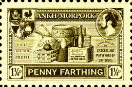
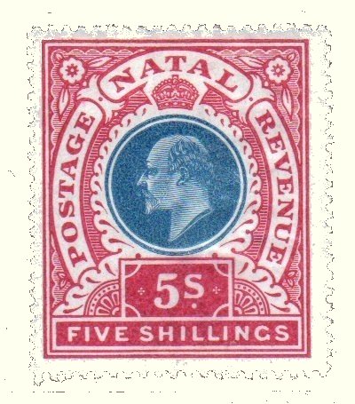
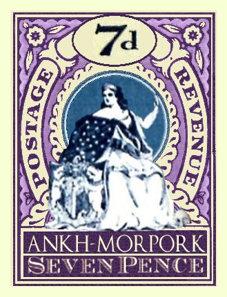
As you will know, some of the Discworld stamps show a remarkable resemblance to some of our own stamps. Whether it is a case of great minds think alike that resulted in the Penny Patrician looking like a Penny Black, or whether some quantum leakage through inter-dimensional portals that resulted in the original Two Pence Ankh seemingly borrowing a design from a pre-WWI German colonial stamp is unknown. But the original Morporkias do have a look alike in the 1902 high value definitives from Natal. I think it would be nice to have one of these to place in my album next to the Morporkias to highlight the differences, but you are talking serious money for a decent example; a damaged over-franked space-filler can set you back over 20 pounds.
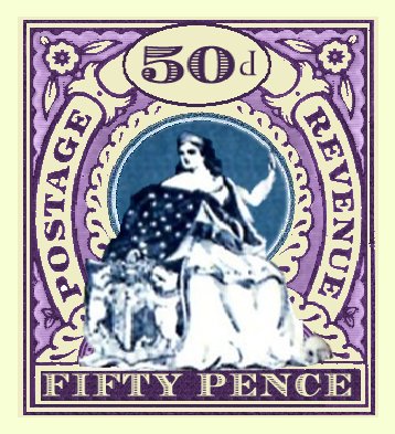
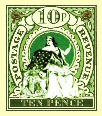
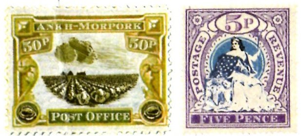
The History of Discworld Stamps revealed some of the prototype designs to the Morporkia stamps. The artwork for Morporkia is covered on another page, so this page will concentrate on the actual stamps. The early designs featuring an early Morporkia varied from the released stamps not only in the values used, but also the colours and proportions. Note that the 50 stamp uses and old style d abbreviation for pence. Clearly how the values were to be represented had not been decided when this design was put together.
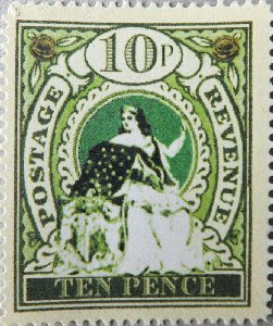
These images are arbitrarily sized, as there is no indication as to what sizes would be used. They were probably printed out for test purposes, but it is unlikely that any actual stamps emerged. The closest that these got to being postal items was in the Royal Mail Smart Stamp scheme. Introduced in 2003 it allowed subscribers to prepare their own pre-paid stationary. This Morporkia and Cabbage Fields combination was trialed in January 2004 as a bit of decoration on envelopes.
..... but if there had been some stamps procuded they would have looked like this.
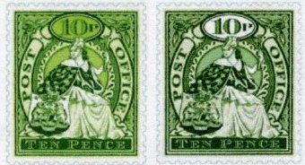
This design, with the finalised Morporkia is close to the final version. The corner cabbages would give up their contrasting colour. There would be still more fine tuning and decisions. I believe these images show some late options on how the stamp would appear. Note the fake perforations; they are mock ups. The left hand stamp is brighter and has a coloured background to the value tablet. And the proportions appear to be slightly different, being a tad narrower, bit this may just be an image reproduction artefact. This was rejected in favour of the more familiar right hand stamp. However I suspect that the reject did get a lease of life when used for the film prop sheets produced for Going Postal, albeit resized to fit the paper used.
|