|
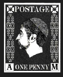
From the very start a Penny Black look-alike was on the cards as the first Discworld Stamp. Several designs were trialed by Bernard Pearson, some of which can be seen on the History of Discworld stamps poster. These were, to be blunt, rather amateurishly produced, but it was early days and they were not intended for a wide distribution. It was a case of toying with the concept of producing Discworld Stamps. They seem to be printed by inkjet, have fake perforations, and were knocked up with PhotoShop. The sizes and proportions of these early drafts varied, though they were always within the range of a small definitive postage stamp. The Vetinari image used on these early stamps all have shorter necks compared with issued examples.
  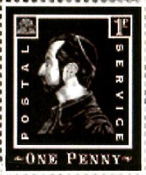
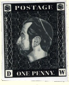 
Similar designs above, but different busts and sizes
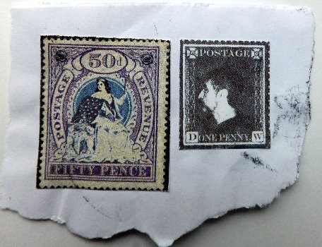
A collection of early stamps and designs, including one still attached to piece of envelope
From the start it seems that actor and DW fan Stephen Briggs would be chosen as the ideal model for Havelock Vetinari. Whether he sat for a profile sketch to be made is unknown to me, but there were such photos taken, evidenced by one being used for one of the early designs.
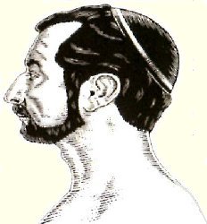 
Note the rather basic skullcap added to the photo
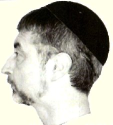
This photo was used on the first image above.
The concept of marketing these stamps to fans and collectors may not have been part of the original aims. Going Postal obviously inspired them, but I believe originally they would have been only used on post from the Discworld Emporium, and perhaps even restricted to post from them to Terry. It has been said that some of these fooled the Royal Mail. What is more likely is that the Royal Mail got used to decorated fan mail to Terry and one or two slipped though. Other recipients may have had to stump up for the excess postage and charges.
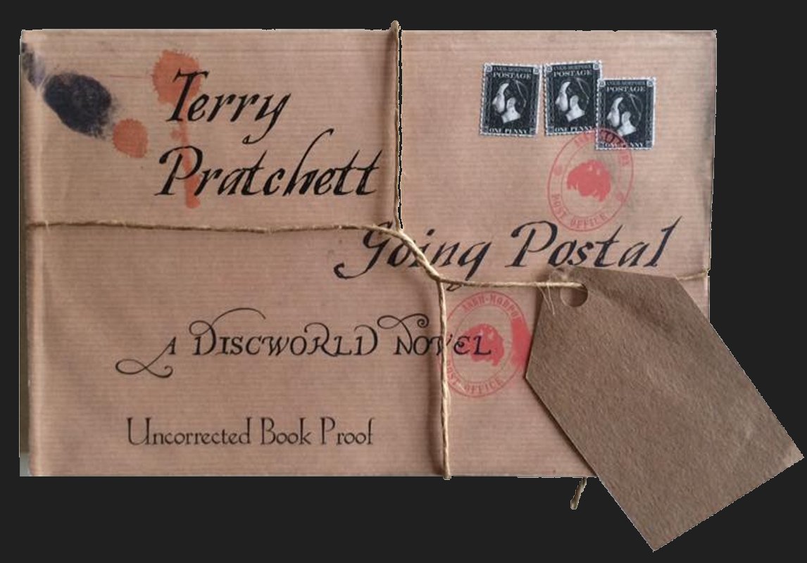
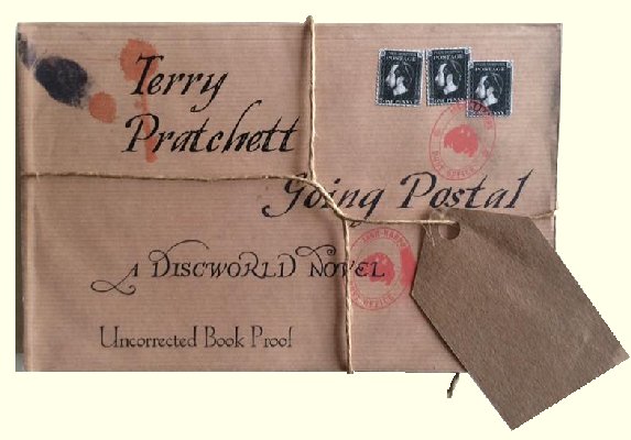
Going Postal was probably not completed while a lot of this was happening. Hence some of these early trials were credited to Crisplocks rather than Teemer & Spools. The Royal Mail SmartStamp was explored with one design, and another was used on the wrapping (unfortunately printed directly onto the wrapper but still looking like adhesives) for advance copies of Going Postal sent out for proof reading purposes. The importance of this item should not be underestimated. First the first time there is a signal that real stamps could follow, and they do provide the first illustration of Discworld Stamps in use on post.
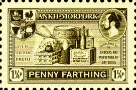
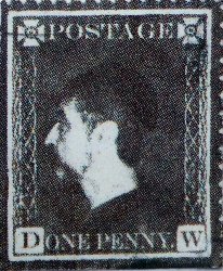
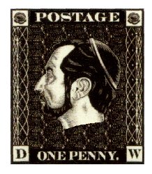
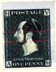
I believe that when Alan and Colin were brought in to refine and provide professional input into the stamps they explored ideas away from the Penny Black; still featuring Vetinari and with a range of ideas for the icons in the four corners. Eventually, the Penny Black style won through and work began on a design as close to that as possible even down to the dot after ONE PENCE. This is an early design they worked on, with rather too bold HV and AM corner letters. Even in those days of early 2004 the concept of a sport was being considered. Those red lines were part of a plan to have the colour changing like a venetian blind opening a vetinari blind perhaps?).
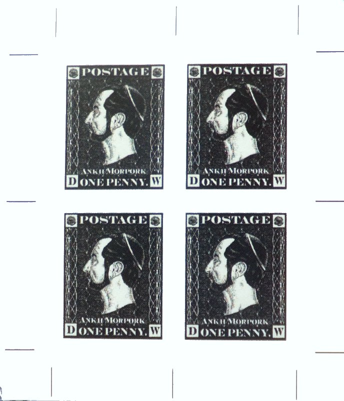
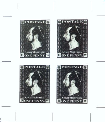
The corner cartouches would eventually settle on cabbages on the top, and D and W below. Some imperforate miniature sheets of 4 stamps were prepared, prior to Perforation Day, to ensure that print quality and resolution was of the required standard. These were never perforated.
|